We have just published an online CSS Gradient Generator tool (still in beta state, so please experience it and don't forget to share your thoughts), in which our aim was to implement all standards compatible gradient functionality, yet keeping it simple and straightforward to use. We experienced some issues until the development, and here I want to share them.
Crashing tab in webkit based browsers
The first issue was that we found a bug which caused all webkit based browsers to crash. It is crashing with all OS's, but it is the worst on Linux, which sometimes freezes the whole OS for minutes (I think that it is fulfilling the whole memory before the browser recognizes that something went wrong). It is much better on Windows which recognizes the error instantly. I have reported the bug to chromium and safari bug trackers about two months ago (right after figured out what is happening), but the issue is still present.
The issue is with repeating radial gradients, where gradient length is equal to zero. Some examples (you can apply them to any element, but beware that they may crash the current browser tab and the whole OS can freeze for minutes!!):
background-image: repeating-radial-gradient(closest-side circle at 0% 0%, #fff, #000);
background-image: repeating-radial-gradient(closest-corner circle at top left, #fff, #000);
The solution on our side was to make some check for these cases, and generating only simple background colors instead of gradients (with the last color-stop's color, just as the other browsers are rendering these kind of gradients).
Wrong gradient rendering in webkit
In same cases Chrome renders the gradient very ugly (maybe if the stop-points are not far enough or the gradient is applied to a very large element), as you can see in the following image (used this gradient):
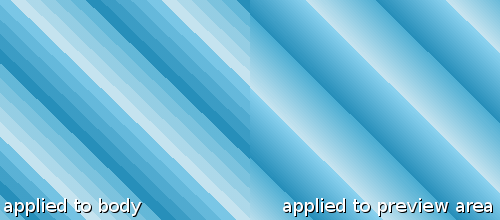
Sadly we didn't find any workaround for this issue, so you need to test your gradients in Chrome and avoid using the ones that are rendering badly.
Many outdated information on gradient syntax
There are plenty of information about CSS gradients, but many of these are outdated nowadays, when most browsers supports the prefix-free standard gradient syntax or at least the -webkit-prefixed syntax (which is very different from the prefix-free syntax, as you can see below, but our tool is generating it alongside with the prefix-free version). you can find up-to-date browser usage statistics on statcounter (December 2013). IE8 and IE9 are still problematic, but we decided not to support these outdated browsers (hope they will disappear soon - the sooner the better, and you can fasten this process as simply not supporting them). Android 2 is a special case, it supports the prefix-free syntax when using Firefox for Android, which works on Android 2.2+, and has much better standards support than the old Android Browser. The -webkit-prefixed syntax is needed for older iOS devices where it is impossible to update Safari (and there is no alternative browser with newer rendering engine - all iOS browsers are using the exact same webkit engine due to Apple's licensing issues).
I have decided to sum up the correct syntaxes, so here they are:
Gradient syntax that works in current browsers
Linear gradient syntax
background-image: linear-gradient(DIRECTION, STOP-POINTS);
    background-image: repeating-linear-gradient(DIRECTION, STOP-POINTS);
Direction should be defined by an exact degree (60deg) or with keywords (to top | to bottom | to left | to right | to top left | to bottom left | to top right | to bottom right).
Stop points are comma-separated pairs of color and position, where the latter is optional (red, blue 30%, green).
Repeating linear gradient syntax is the same, but defined with repeating-linear-gradient().
Linear gradients and the -webkit prefix
The -webkit prefix is required for some older touch devices, and the syntax is different from the prefix-free version in many aspects.
Differences between the prefix free and the webkit prefixed gradient definition
- there is no need for the `to` prefix before the direction keywords
- the direction keywords in webkit syntax represent the starting pont of the gradient, so it is defining the opposite direction compared to the prefix-free version.
top rightis equal toto bottom left. - when using degree values, 0deg means bottom to top in prefix-free syntax, and increases clockwise, while in webkit syntax 0deg means left to right, and goes anti-clockwise. Value can be converted from the prefix-free value with the following formula:
Webkit degree = Math.abs(degree - 450) % 360
Examples of linear gradients
-webkit-linear-gradient(right, red 0%, green 100%);    /* direction is the opposite of the prefix free version */
    linear-gradient(to left, red 0%, green 100%);

    -webkit-repeating-linear-gradient(bottom left, red 0%, green 30%, blue 90%);
    repeating-linear-gradient(to top right, red 0%, green 30%, blue 90%);

    -webkit-linear-gradient(30deg, rgba(0,0,0,0.1), rgba(0,0,0,0.9));    /* don't forget to convert the degree value */
    linear-gradient(60deg, rgba(0,0,0,0.1), rgba(0,0,0,0.9));
Radial gradient syntax
background-image: radial-gradient(SIZE SHAPE at H-POSITION V-POSITION, STOP-POINTS);
    background-image: repeating-radial-gradient(SIZE SHAPE at H-POSITION V-POSITION, STOP-POINTS);
Size should be defined by an exact value for circles or by two values for ellipses (30px for circle, 30px 40px for ellipse) or with one keyword (closest-side | farthest-side | closest-corner | farthest-corner).
Shape is either circle or ellipse.
Positions should be defined by exact horizontal and vertical values (10px 10px) or with keywords (left | center | right for horizontal position, top | center | bottom for vertical position).
Repeating radial gradient syntax is the same, but defined with repeating-radial-gradient().
Radial gradients and the -webkit prefix
The -webkit prefix is required for some older touch devices, and is different from the prefix-free version. To make it more complicated, there are two different webkit syntaxes, one for defining the size with exact values, and another one to define the size with keywords.
Webkit radial gradient syntax with exact sizes
background-image: -webkit-radial-gradient(H-POSITION V-POSITION, MAJOR-SIZE MINOR-SIZE, STOP-POINTS);
    background-image: -webkit-repeating-radial-gradient(H-POSITION V-POSITION, MAJOR-SIZE MINOR-SIZE, STOP-POINTS);
When using the webkit prefix with exact sizes, the shape must be omitted because it is defined by the major and minor sizes, which are equal for circles.
Webkit radial gradient syntax with keyword defined sizes
background-image: -webkit-radial-gradient(H-POSITION V-POSITION, SHAPE SIZE, STOP-POINTS);
    background-image: -webkit-repeating-radial-gradient(H-POSITION V-POSITION, SHAPE SIZE, STOP-POINTS);
When using the webkit prefix with keyword defined sizes, the keyword for the shape is required. The keywords for the shape and the size are fortunately the same as for the prefix-free syntax.
Conclusion
CSS gradients are still problematic in the newest browsers, so they need to be used carefully, but building the gradient generator was a great experience for us, and we decided to publish more CSS related tools in the near future.
If you like this article, then please share it, and don't forget to follow us on Twitter, Facebook or Google+.